Saturday, 16 April 2016

Sorting out Photos for Production

During the first Photo Session I had I had accumulated around 123 Photo. While taking the photos I tried making other ideas aside my initial plans for poses of photos though I came across staying with my original ideas mentioned in my past post of planning for the photo.

Over the different poses I had to filter to find the 'best' picture of each one as some would have been when my model wasn't ready or it just didn't look as planned and needed adjustment. A long set of photos were taken so I pick groups of each pose to display showing changes and such in the process of it.

Wednesday, 13 April 2016

Planning for Photos

For planning I have looked at music magazines to get an idea of what my chosen model should wear and how they should pose, look,and wear. All relating with Cinematography and Mise En Scene for the shoot.

What I would need to know is the recommended clothes, colours, facial expression, poses and angles of the shot and what should be for a background if necessary.

My target of magazine would be to make an EDM magazine so looking into EDM magazine would be appropriate to do to get a sense of what I would need for my own magazine

IMAGES OF EDM MAGAZINES


With these front covers this will help give me idea on the dress sense of what my model should have and help towards a final design concept for my front cover, I should also look into each magazines for the contents page and DPS using some features and adding my own. With this I have seen what I need for my model

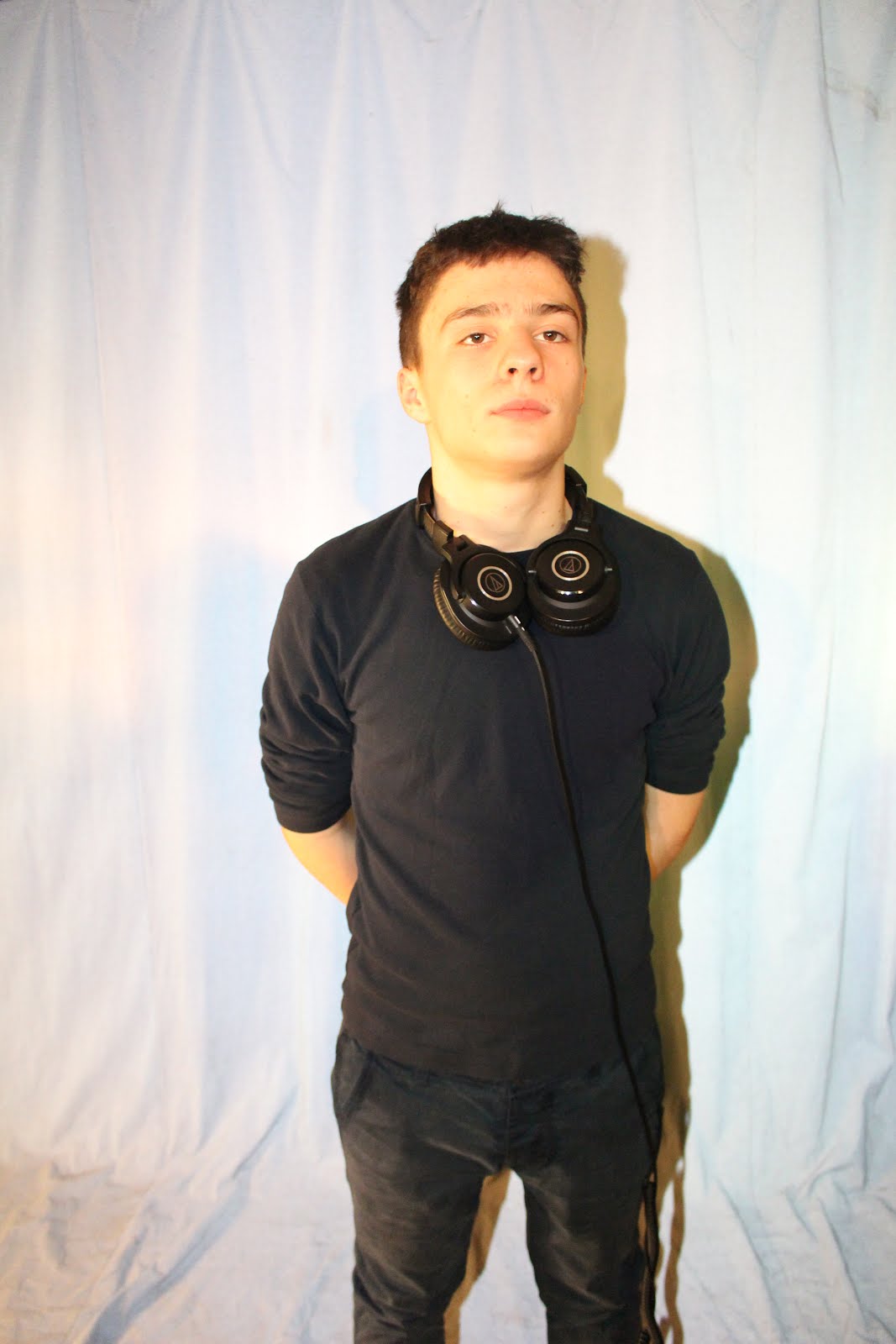
For clothes it seems to be simple in most, most have a shirt of one or two colours while there would be the occasional  shirt that would have a design or pattern but for mine I will keep with the most common which would be to have a T- shirt or polo Shirt with one or two colours. 

If there was to be more than just a T -shirt on top would normally be a smart Jacket / Blazer or a Denim or Leather Jacket. There isn't much use of ties except the last Image (Rolling Stones - Daft Punk). 

Most clothing choices would lead to casual formal design while some would look very smart (Suit, Tie, Formal Trousers) and others set back and just full casual (Simple Shirt, Jeans / Chinos). 

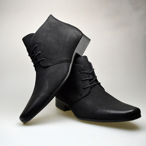
For shoes if it was a Casual or Casual Formal choice the shoes would be something such as Casual boots or Trainers. However in most of the shots they go above the waist or even just Close ups to where shoes would not be noticed

Given in some magazine some more know artists have masks / helmets to for some sort of recognition, rather than presenting their face they should their mask / helmet.

Summary List:
T-Shirt / Polo Shirt
Suit Jacket / Blazer
Denim / Leather Jacket
Jeans / Suit Trousers / Chino
Smart / Casual Boots
Occasional:
Tie, Mask / Helmet

Images of Mentioned Clothes
T-Shirt / Polo Shirt

Suit Jacket / Blazer

Denim / Leather Jacket

Jean / Suit Trouser / Chino

Smart / Casual Boots
Tie / Helmet


---------------------------------------------------------------------------------------------------------

Pose / Stance / Position / Facial Expression

This would have to split for each page that would be done. Front Cover, Contents Page and DPS. I can use the First set of Images that were shown but I would also then need to show examples of contents pages. For EDM magazines I've come across a few that dont do content pages but a fairly large editor's message / letter and most make it sound like how they want the reader to explore it rather than pick out their own interests. Being that EDM Magazine does this and is a common Magazines for the EDM genre can show alot. Other magazines such a MixMag and BPM do have content pages and will what I will use for examples for images relating to the contents page and will use all three for the Double Page Spread examples and ideas.

Starting with a front cover my idea would be to have a serious and funny style to it, I would have two models to which one would be partially serious and the other would be silly and doing funny stuff. The intended Idea would be to show the contrast of EDM magazines. As you see in some front covers aside serious faces there some smiling or grinning and even the Iconic figure Deadmau5 who wear's his mouse helmet that look happy and makes it feel a bit less serious is what I would want to do.

For Contents the idea was to have both model on either side with the contents running down the center of the page and other details to the side, though I feel I might need to make changes in this, I would make it more simple, having the page split in half, with one half having things such as Editor's note, Social media information or even the highlighted article. Along with an image for the highlighted article.

For something of the DPS I would aim for something with a full body shot, given space for text on the page the pose would be something to show the models full body, being able to work with that I would add to have an image that looked laid back but still kept with the EDM genre.


Saturday, 26 March 2016

Plans / Ideas for the Front Cover, Contents Page and DPS

------------------------Front Cover------------------------


--------------------------Contents Page--------------------------


------------------------Double Page Spread------------------------


Friday, 25 March 2016

House-Style, Logo and Title


TITLE AND LOGO

With the style for the Mast Head I would look to have the Font as a 'Techno' styled font.

I used www.dafont.com and  https://typekit.com/fonts for looking for fonts.

 I would look for a in between for a Sans Serif and Mono styled font. It would be best with a curve to the font and it would have a lot of weight in the font, meaning to be very thick. I would say best to have the width to not be stretched too far and having the height to be fairly balanced in the font. In all EDM / House styled magazine the fonts would be big and stand out clearly. No 'Noise' or complexity to it in most cases so that is what I will look when making my own.

Thinking for title names I came across thinking of a few and had a few ideas.


Electronic Music Magazine - EMM

This title would be very clear to it relation to a music magazine, it would stand out and even though it is a long title it can be abbreviated to EMM, something that would still appear to stand out and sound a bit catchy with this I could already think of expanding in a design of have the abbreviated characters in large with the full title name covering the top of each letter. Something done with most Titles that have a long name to it and can be abbreviated

House Beat - HB

Similar to EMM but it was more short and simple, have both 'House' and 'Beat' it have a clear correlation to the genre of the magazine and that it is related to music. With this I would be able to have another possiblity for a catchy name to my magazine and that I could have. But I would also think of other ways I would show the Abbreviated and full title on a front cover display and if I would chose this name I would work on that further.

Equalizer - E

A one worded name that would have a clear and unique understanding the niche audience EDM / House targets. Equalizer is simply the modification of sound in a song which is applied to most if not all EDM / House music. This would be something very good to use for targeting a niche audience and would be a full title with not abbreviation. Being a one worded name and a niche styled name it would be great for the magazine.


 House Style

For the house style I would use a mixture of what I have gathered to have in the magazine. 

Colour

For Colour I would take into consideration would be White, Blue / Navy, Red, Black. These would what I would have as main colours, I may change or keep this the same the closer I get to starting the first magazine draft. These colours are one simple and have proven to reflect onto the EDM Genre for magazines. The colours combined represent Energy, Powerful yet Calm and Strong. With these colours also I would be able to make a contrasting colour pallet, which follows to the code of convention with magazines. With the Title the colour will be one colour, possibly just white or black) as the colour are very simple yet contrasting. Colours like Red or Blue would be used to Highlight key things in the Magazine to stand out and catch attention of the reader.

Language

Language would be very key for all pages of the magazine, I would need to match the language style to something that would match the personality of the readers. It would need to be able to engage with the reader aswel as be understandable to them. The age range would be from 17 - 27 as a given target to match for their level of English, this would change to the complexity of words used aswel as the structure. The words used would be something that keep the energy in the magazine going and would stand out strong but the key thing would be keeping the reader's attention. Having a bit of persuasive language to pull them into reading the magazine.

Layout

Layout would be very important in making the design of the magazine. It would be how you represent the magazine to the audience and the Front Cover being very important to how the magazine would stand out. If the layout would be the same each time for the front cover or change it would still need a key way of standing out to the reader and audience. I would need to work on style that would seem best for the magazine and think ahead on colour placement. The layout would be managing the positioning for the feature for all pages. I aim to make 3 Layout style for each the Front Cover, Contents Page and DPS and maybe merge or change totally those layout in the end but at-least I have a starting point
 

Thursday, 24 March 2016

More into the Psychology of colours and Final Decision on Genre


This is a very basic mind map of basic colours and what they each represent. This will help to go towards making my magazine meet the personality of my selected genre. My final decision is to make a EDM magazine (Electronic Dance Music) and in terms of colours it will need a powerful yet energetic feel with a more open feel or reading also with a cool vibe to it and with use of the results from the magazine.

The Survey got Navy and Black to be the most favorable followed by Peacock and  Red a just a bit behind.

Each colour would show:

From Survey

Navy: Authority, Power, Strong

Black: Power, Strong,

Peacock: Loyalty, Calm / Serenity

Red: Energy, Dangerous/Bad , Excited

Aimed For EDM Magazines

Black: Power, Strong

White: Blank, Open

Red: Energetic, Excited

Green: Cool, Wealth

Blue: Loyal, Serenity